Storyboard and Concept Artist

K. Sean Sullivan Art Blog

My Favorite Storyboard Sketches

Drawing
Storyboards

Most of the work that I do in storyboarding starts out really rough.  The client wants something very quickly (and rather cheaply as well).  So the first pass naturally is drawn small and loose.  This keeps it quick (and therefore cheap) and invests just enough effort to demonstrate the gist of the idea.  It is understood that if the ideas seem to be working, the drawings can always be refined in the second pass.

Sometimes the project disintegrates before it ever has a chance to get refined.  Sometimes the drawings are redrawn to a much higher level of finish.  And many times the rough sketches are sufficient to communicate the idea and the client chooses to move forward without refining any drawings.

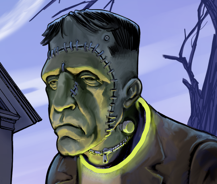
As a result of this sketchy process, a good many of my individual storyboard drawings would not be worthy of showing off, being out of context and all.  But from time to time, a beautiful little drawing comes out, that is made all the better by the fact that it was created in a spontaneous and gestural manner.

EXT 2 shot depicting sword fighting action. I typically use pencil and paper to start my process.


For me the preferred method is to sketch freehand on paper without any framing boxes.  Sometimes I’ll even sketch subjects separately.  I almost always scan the drawing for delivery anyway, so once it’s scanned I can frame it up and manipulate individual elements with the computer software.  Using the computer allows me to experiment to find the best framing and composition.


I also can create lighting effects very quickly in the computer.  Much more quickly than trying to shade with the pencil.  Knowing this, I can abbreviate my pencil time.  Sketch fast, and finish it in the computer.

This shows the original pencil work and how I enhanced the lighting using brightness and contrast settings. Then a simple spot effect for the flashlight, and it turns out rather effective with a minimal time investment.


Working this way makes it quick and relatively easy to make changes.


I like this high hat shot because it is simple, easy to read and has drama in the composition.


This canted shot is one of my favorites because it materialized quickly and has powerful drama and action.
This canted shot is one of my favorites because it materialized quickly and has powerful drama and action. This is a good example of a very minimal sketch that got rich quick in photoshop.


I think it is important to be able to convincingly portray facial emotions. Sure the actors will eventually take care of this business, but if people are not moved by the drawings, the storyboards loose power.


One of the fun challenges for me is to be able to use extreme angles to achieve variety in visual richness and emotion.


Here's another shot that really comes to life with some time in photoshop.


In this typical "gunfighter" shot, I used pen over pencil. The pencil is used to rough out the form, the pen is my tool for pulling out the shapes and lines that I want to be strong.


Just pencil in this low angle action-over shot. I like it for it's simplicity, yet it still clearly states the intentions for the shot.


This quick pencil sketch successfully conveys the anticipation of these two monks.


Pen over pencil helps create an intense portrait in this MCU for TNT television.


This arrow helps to clarify that the rancher is loading and not unloading the bales. Graphite pencil over blue COL-ERASE pencil is the only medium used here.


I like this for it's simple composition. It's balanced and emotes tranquility except for the subtle way she is looking at her watch. Something is not entirely right yet.


The coloring here was achieved in photoshop, as was the lighting. There's nothing better than a white paint brush in photoshop to pull highlights back out of a sketch.


This is an example of separate sketches being cut and pasted together in one shot. It could take much longer to draw and even redraw to get all these elements to fit together in the best way.


This establishing shot took some care in the stagecoach and horses, but very little pencil time was spent on the rest. Photoshop gave a rapid enhancement to the landscape and sky. Really made it come together.


I like this sketch for it's clarity in a wide establishing shot that must include a lot of general information and some particular information.


Action shots are always fun, especially with the depth of field contrast we see here. Ink over pencil as well as photoshop toning were used here.


I have always had a keen interest in anatomy and figure structure, so these are fun to do.


It's fun to try to wrap your head around the idea of what a shot would look like from inside the dashboard, but unfortunately the film makers didn't have a cut-away filming car to work with. The camera wouldn't fit into this space without a really short lens that would distort everything. I'm still happy with the drawing anyway.


This is simple and clear. Just pencil, scan and paste into the page for delivery.


One of my earliest boards from 1993 (Disney's Fantasia Continued). No computer trickery here. Pencil, Grease Pencil, and marker (Sharpie).


Crowds can be a challenge, so it's nice when they materialize into a nice composition like this.


I'm a big fan of film noir. I like the use of shadow and light. Here the menace is all in the shadow, the subjects are contained in only a small portion of the frame and the emotions on the faces resonate and emote clearly.


I'm very happy with the way this guy is alone in a crowd. If I didn't capture that, then this drawing would only depict a Med CU and nothing more. Which may be enough for some, but I like to show the mood and emotion whenever I can.


Here's another shot of the gal in the car. They were able to get the camera on the floor and achieve this shot.


I knew what I wanted here, but didn't take the time to shade it with the pencil. The lighting came in photoshop.


Oh Mr. DeMille, I'm ready for my close-up. My wife is related to Mr. DeMille.


Cute girls can be hard to capture in an economical swipe of the pen or pencil, but I'm very happy with this drawing. Fresh and clean, this was done in the first pass, no over-working this drawing, only toning in photoshop.


I tend to use cartoony looking people when sketching for slap-stick comedy.


Composition just means everything, and this one works well for me.


Sure, this kind of drawing takes a few more minutes than a simple one, but for the amount of pageantry that needs to be described, this went vey quickly. I did the banners separately and cloned them so I could position them without too much trouble.


Mood means everything in film composition too. So much of that mood is contained in composition and lighting.


One of the primary attributes that all drawings need is appeal. If you're drawing a pretty girl, she better LOOK pretty. This can be hard to do consistently and in rough sketches, but I think I achieved it here. Hope you think so too.


Complex depth, and a crowded orchestra becomes a series of light and dark shapes arranged carefully, economically, and almost abstractly.


Leave a Reply

Your email address will not be published. Required fields are marked *